VISUAL DESIGN
|
BASICS
What: product, service or event When: launching soon, happening now or an exact date Where: venue or location Who: Brand Why: Value INTERESTING Who are you What's your story When did you start Where do you work Why do you do it BOOKS AND LINKS
Create your Adobe Creative Cloud account HERE, it's Free. Non Designers Design Book Usability Basics Instagram Designers Behance Designers PiktoChart Templates GIMP PIXLR SumoPaint Krita Pixelmator More Templates Canva online Canva iOS Adobe Spark Adobe Spark Video Adobe Photoshop Mix Adobe Photoshop Express Adobe Comp CC STOCK PHOTOGRAPHY Pexels Unsplash Life of Pix SplitShire 73 Best Stock Photo Sites ARCHETYPES 12 Types |
Principles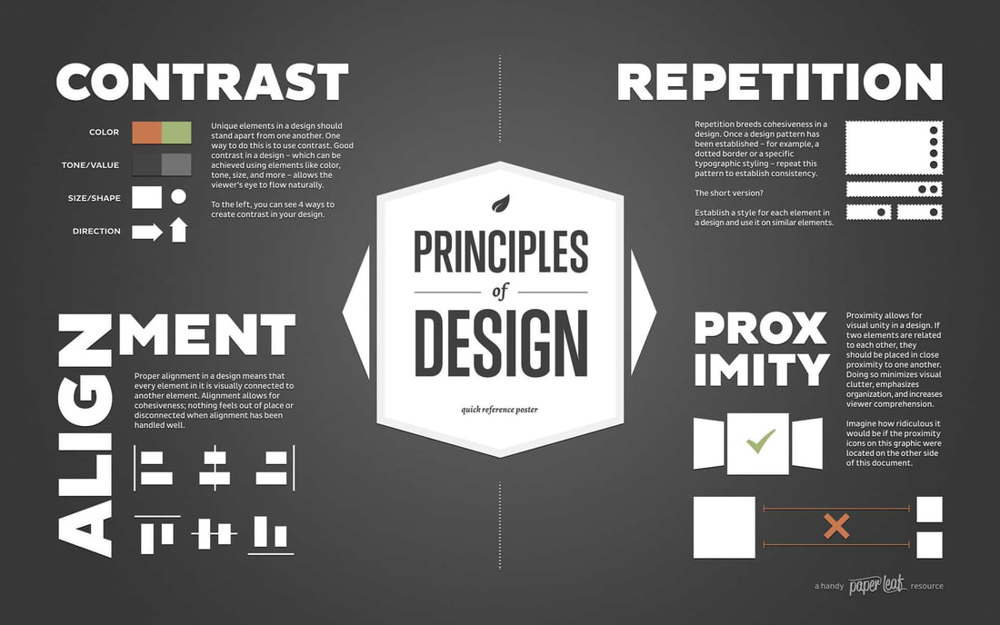
Elements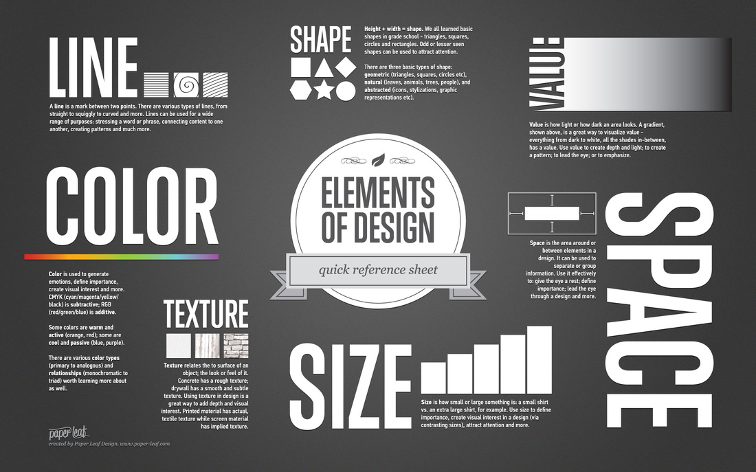
|
extra visual design tips:

|
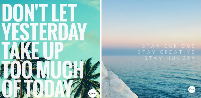
1. Stop using so much text
Text can get really overwhelming really quickly. The point of using visuals is to let colors, shapes, and textures do the heavy lifting. As seen in these examples, when designing with images always place your text within empty copy space. This will make your type easily readable, easily digestible, and ultimately more sharable. |

|
2. Use high quality stock photography
The quality of graphics you promote on social media are are a reflection of your brand itself. A good stock image not only grabs you consumers’ attention, but it can also boost your brand’s credibility and professionalism. Not that many people are going to trust a brand that uses grainy, awkward and cheesy images, especially not when competitor brands use stunningly cheese-free stock images. |
3. Use a range of visual content
There’s no doubt that visual content is the most powerful way to engage fans on social media. But they don’t want to see the same thing over and over again. How to solve this problem? Create a variety. Here’s four types of strategy:
There’s no doubt that visual content is the most powerful way to engage fans on social media. But they don’t want to see the same thing over and over again. How to solve this problem? Create a variety. Here’s four types of strategy:
Quote graphics
Quote graphics help your fans connect with the meaning and message of your brand – not just your product. |

Infographics
Storytelling is one of the most compelling ways to engage your audience with your brand, and infographics allow you to do this in a visually captivating way. |
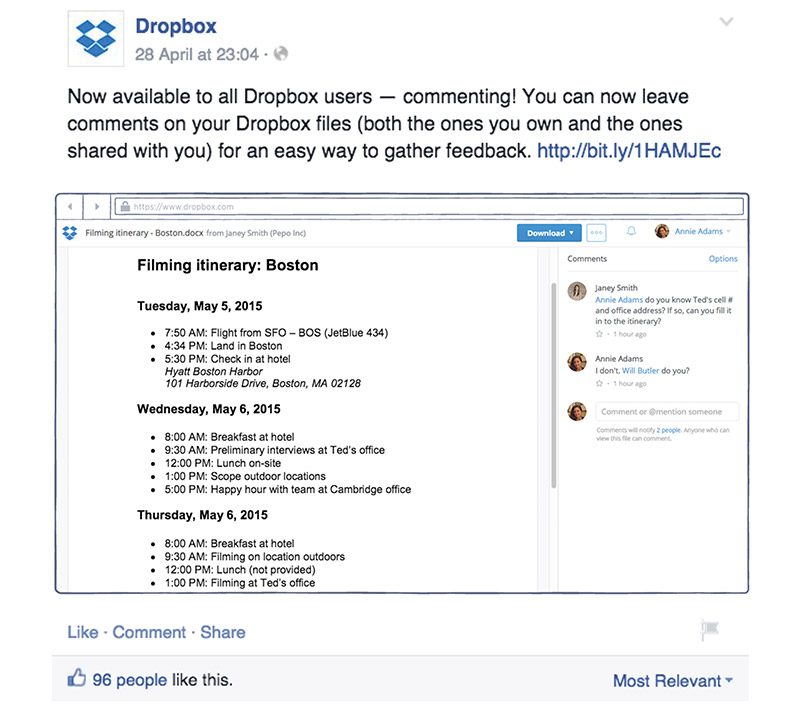
Screenshots
If a customer has a question about doing something, why not take a screenshot to answer a FAQ on your social media page? Or use screenshots to give a sneak peek on something you’re working on. It makes the fan/ follower feel like they are getting exclusive information. |

Photography
Show off your photography skills. Whether you’re on Instagram or Twitter, a great way to bring people into your world is through your own photos that you snap. With all of the great apps available through smartphones, you’re able to take photos on the fly and share them with your audience just as easily. |
|
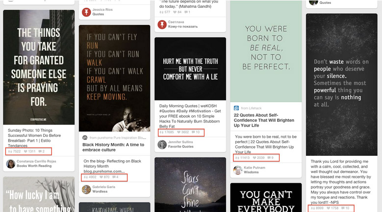
4. Tap into visual trends
Are you afraid that your visual content won’t look hip enough? Pinterest research. You can also use Pinterest to discover what graphics are resonating with the audience by its number of repins. Notice how the middle pin has almost 18,000 repins. It’s simple black and white, with no background image, and it works because of the message is about not sugar coating. Also take note that “but never” is visually emphasized. Remember graphics don’t need to be complicated to be impactful. In fact, the simpler the better. The current trend is to strip away any elements that compete with your message. |
5. Brand your graphics
The point of creating highly shareable social media graphics is to drive people back to your site. There’s nothing worse than finding an informative graphic, and wanting to get more information from the publisher, but not knowing where it came from.
Make sure that you always, without a doubt, add a watermark to your graphics. And no, it doesn’t have to be an obnoxious, full color logo sticker. A simple link to your website towards the bottom of your graphic will answer the need for branding.
Also, don’t forget about templates. No matter if you’re using quotes, infographics, photographs, or other elements, be sure to create a template for the sake of consistency. When you follow a graphic template, your followers will instantly know it’s you without having to see your name (but you should still add your name anyway).
Consider using the same font type and size, the same emotional message (happiness, silliness, charity), and similar filters for all of your visual content. With a template, you won’t forget what font you used, and you’ll have a stronger visual impression with your audience.
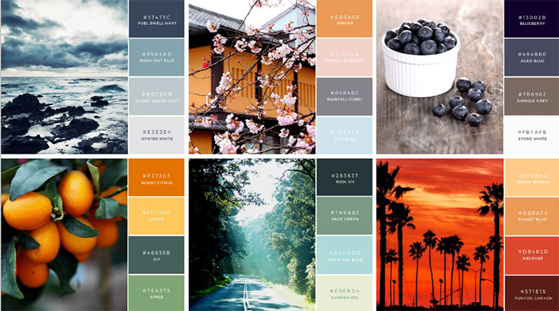
Color Palettes: What is your brand about? Is it young and friendly? Consider vibrant colors like orange or yellow. Is it about trust and dependability? Make blue your stand out color.
Define and use these colors in your fonts and your image borders. Here’s a few color palettes to inspire you: |
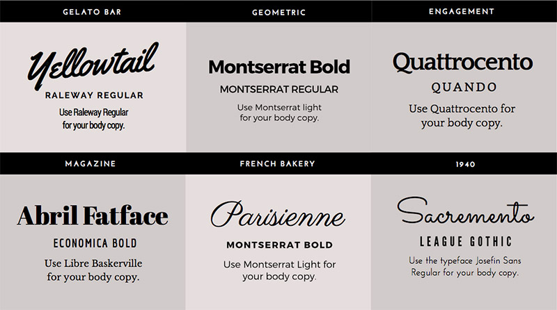
Font Combinations: Take two or three fonts and mix them up for visual interest. There’s no right or wrong font combination, unless you use Comic Sans (which is always wrong), but try to go with a combination of Serif and Sans Serif fonts. Here’s what I’m talking about:
|
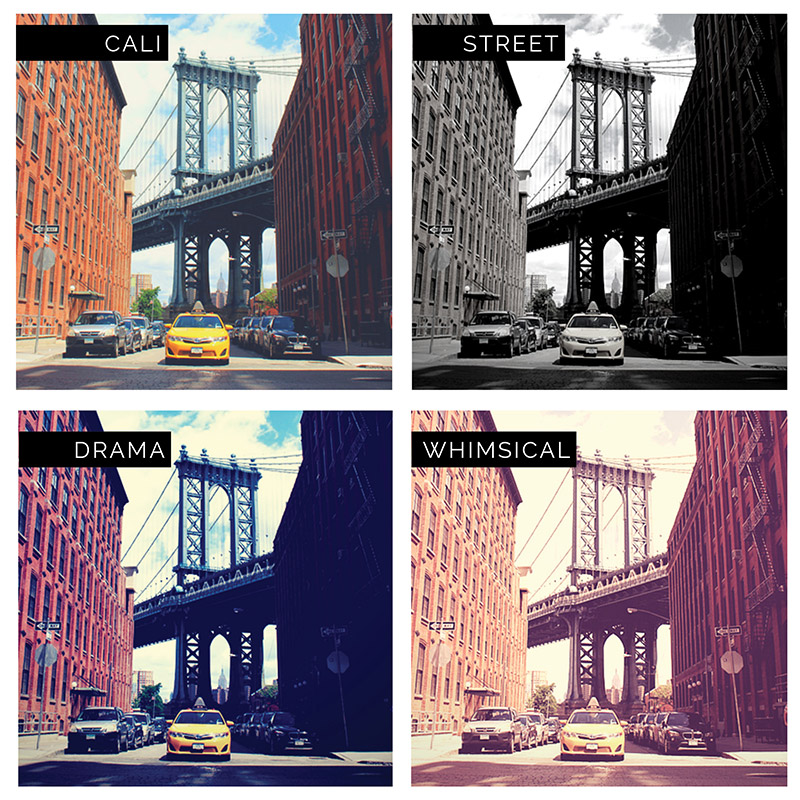
Filters: If your color is wonky or you just want to add a romantic flair to your photos, filters can enhance and elevate. Adding some carefully selected filters can highlight and add a nice touch to your original images, making them twice as appealing and shareable. Take a look at what we’re able to do with one photo using four filters:
|